Clear, repeatable narrative
Unified the simulator and analytics device into one training journey – learn → ride → improve. That framing now anchors investor decks, partnership pitches, and internal planning.
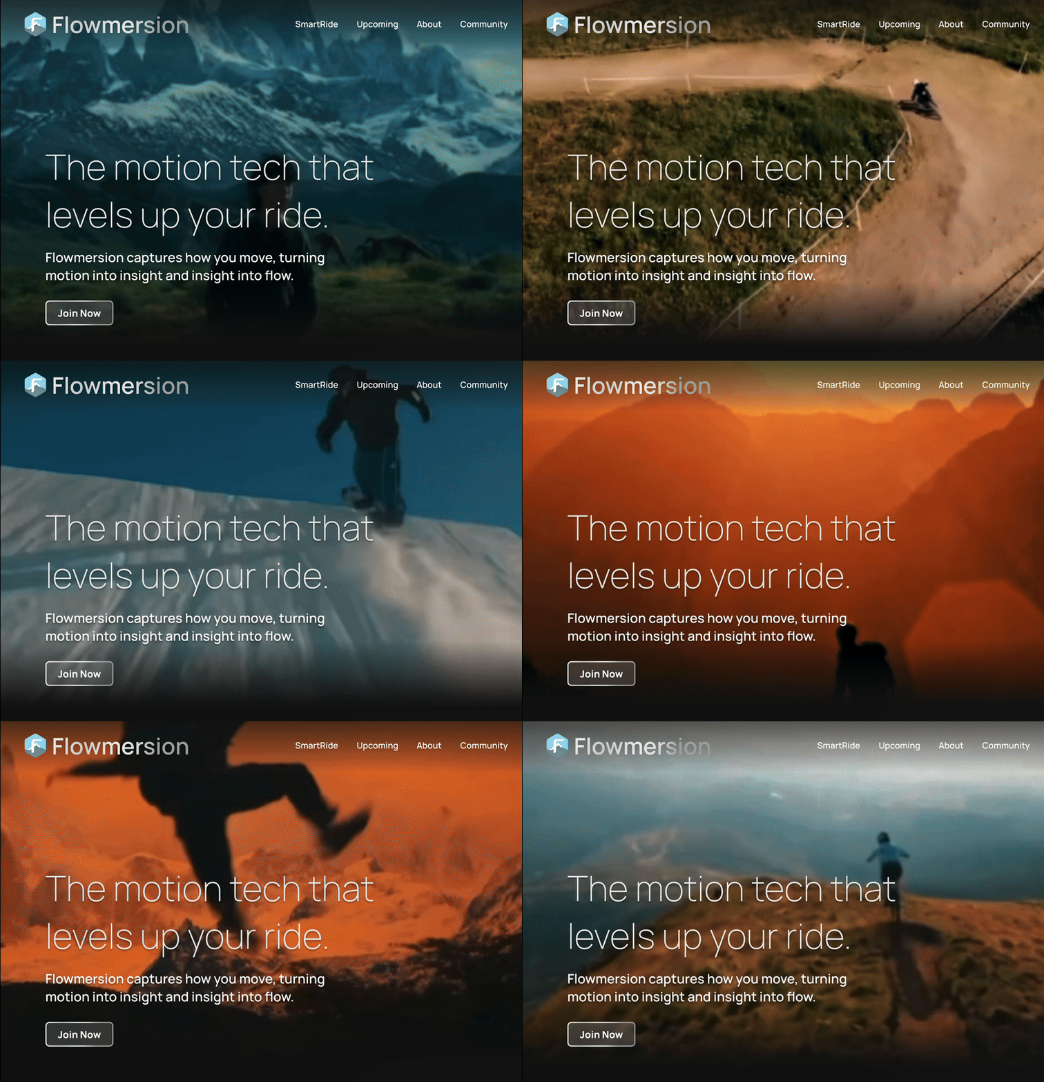
Snow sports are thrilling, but they’re also inaccessible. Gear is expensive, weather is inconsistent, and progress can be hard to measure. Flowmersion set out to change that by building two connected products: a mixed-reality simulator for safe indoor training and an on-slope analytics device for real-time feedback. The vision was ambitious. The story holding everything together wasn’t.
As Product Manager & Developer, I led strategy, product narrative, information architecture, design direction, and the complete rebuild of Flowmersion’s web experience. The goal was to turn scattered ideas into a cohesive, credible, and conversion-ready platform that could support demo growth, pre-orders, and future product expansion.
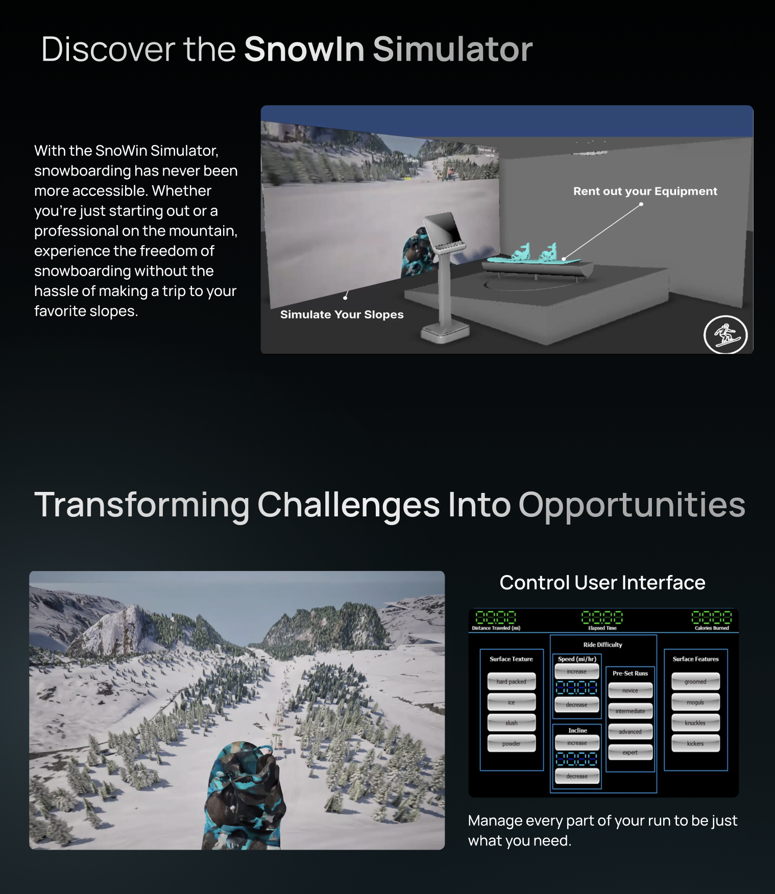
Flowmersion was developing two highly technical products simultaneously. The simulator lets beginners practice safely indoors, while the analytics device captures real motion data on the slopes. Each product was valuable on its own, but their connection wasn’t obvious – riders struggled to understand what Flowmersion actually offered and why it mattered.
The challenge quickly became bigger than “make a nicer website.” We needed a product story that made the tech feel connected, trustworthy, and aligned with how athletes actually learn. No fluff – just clarity that everyone could rally around.
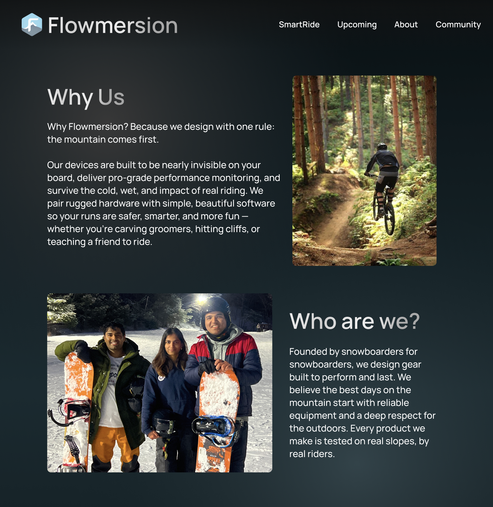
The previous site didn’t reflect the energy or precision of a next-generation XR platform. The narrative was fragmented, visuals were inconsistent, and messaging left users wondering what Flowmersion actually was: a simulator, a hardware device, an app, or just a brand name.
Conversion friction was high – CTA placement was unclear, mobile layouts broke in key flows, and credibility cues were thin. Flowmersion needed more than new UI; it needed a cohesive product narrative that could grow with the company.
Craft a unified training story that connects the simulator and analytics device into one brand – and turn that story into a site the team can actually ship against.
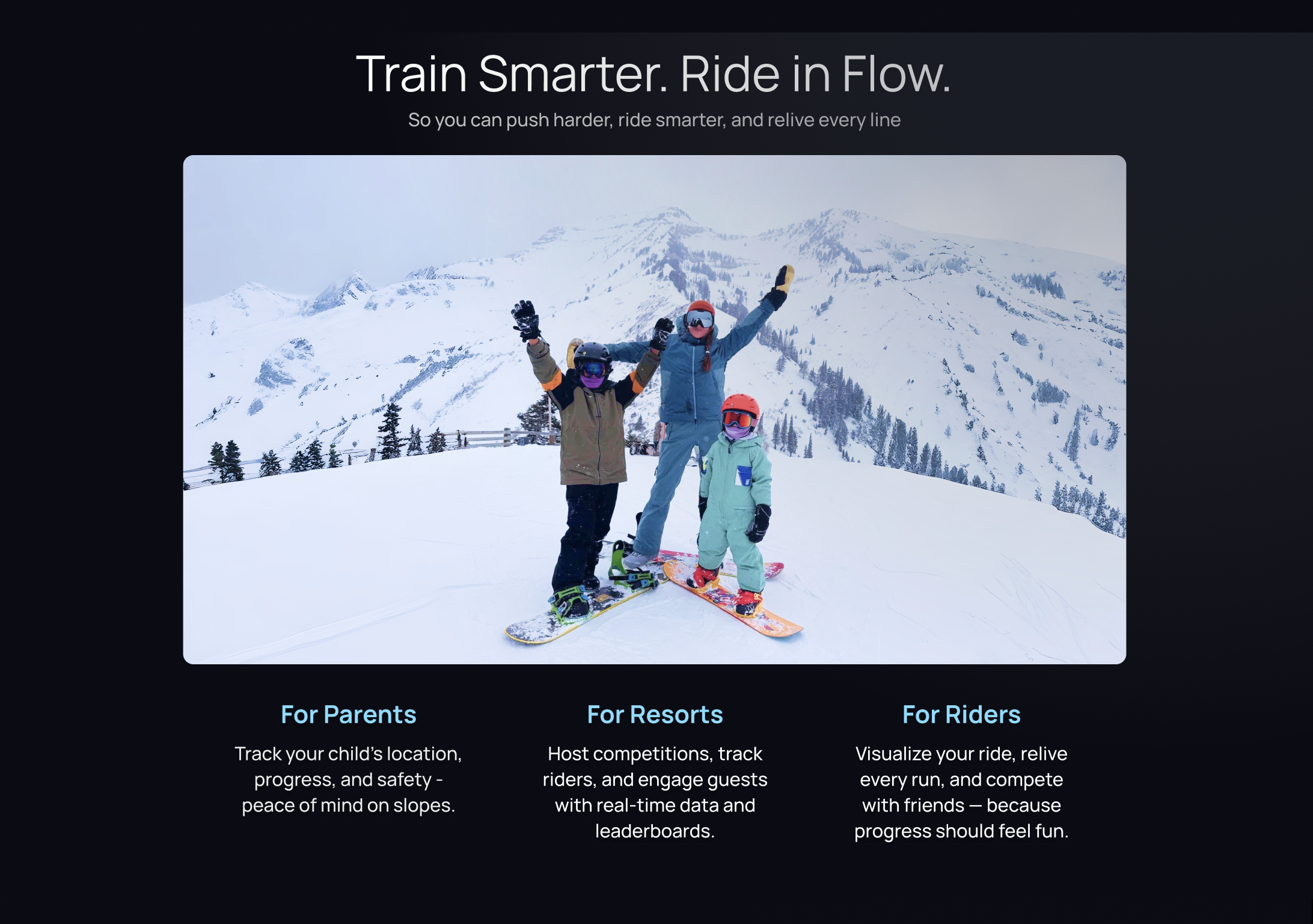
Research and client interviews surfaced three primary user groups, each with different needs but overlapping motivations around safety, progress, and connection.


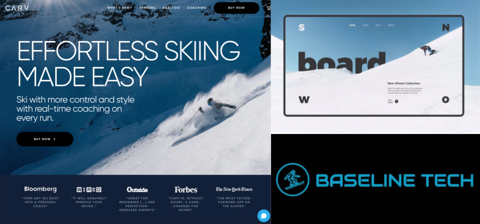
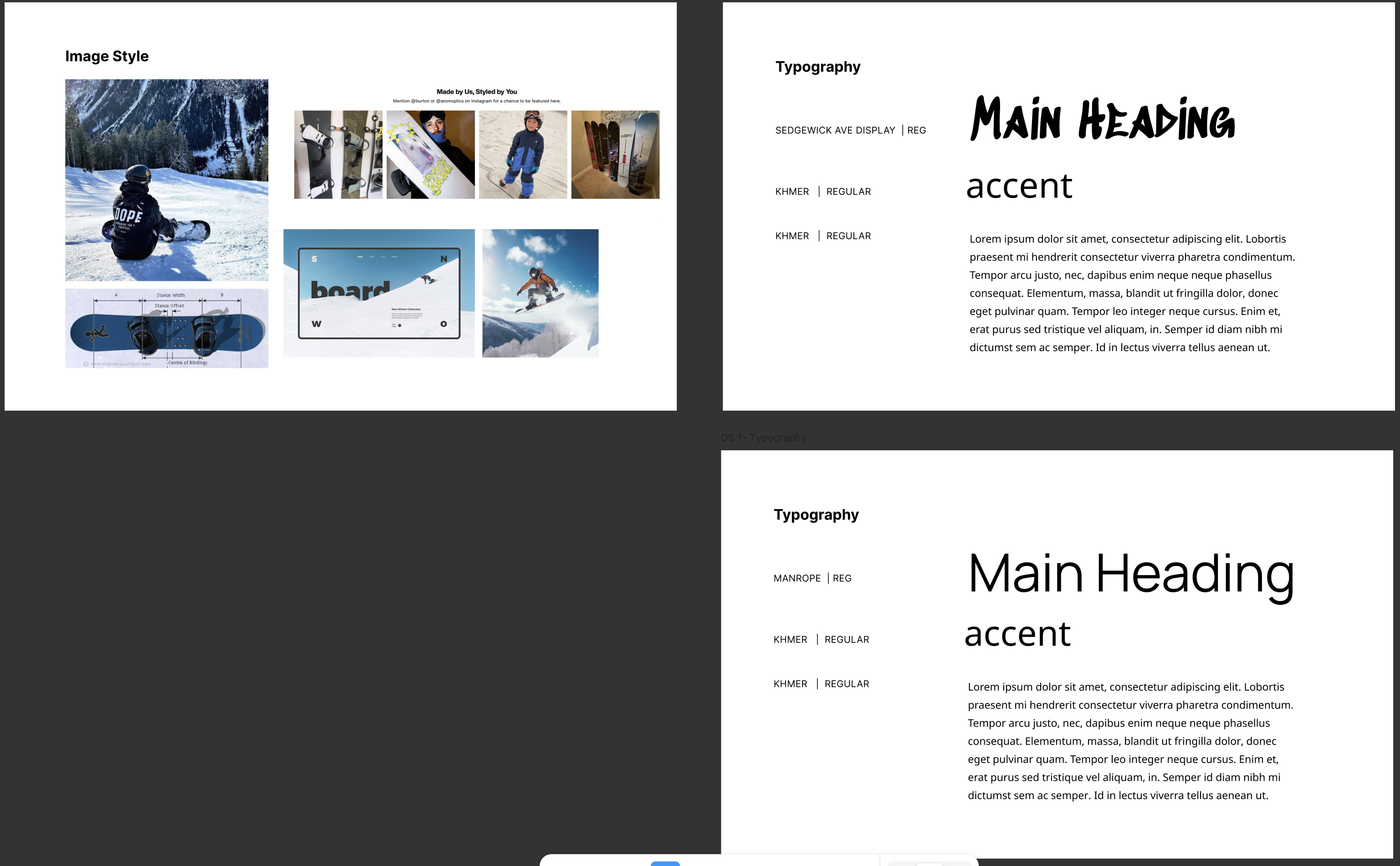
The client cared deeply about competitor research, so I asked every team member to run focused audits across ski analytics, fitness tech, and XR training experiences. We combined our notes into a shared research packet that guided product and brand decisions.
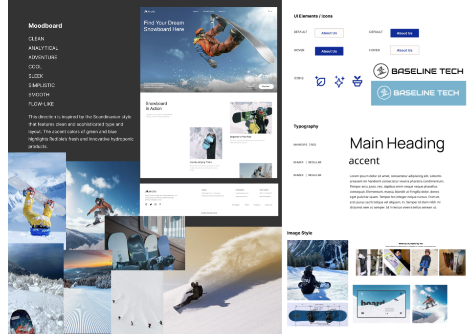
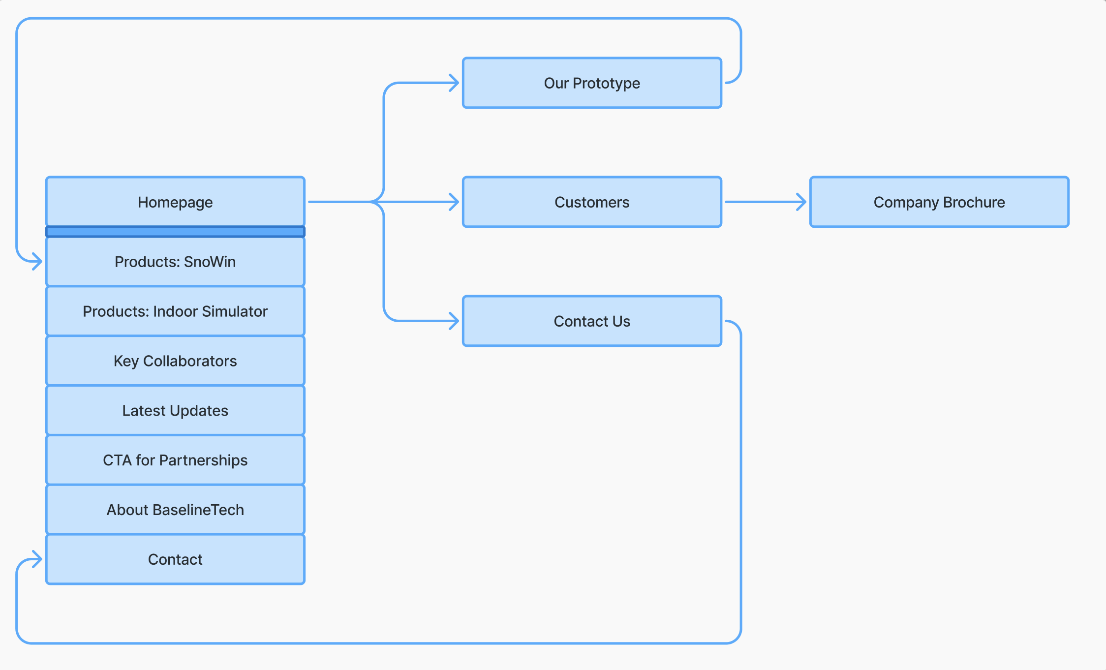
To keep scope focused, I restructured the site around a single training loop: discover → understand → commit → stay engaged. Every page had to earn its place in that journey.

Flowmersion’s hardware is serious engineering: sensors, radios, and custom boards designed to survive cold, impact, and snow. But most riders will never read a spec sheet, so we had to translate this into trust and clarity.
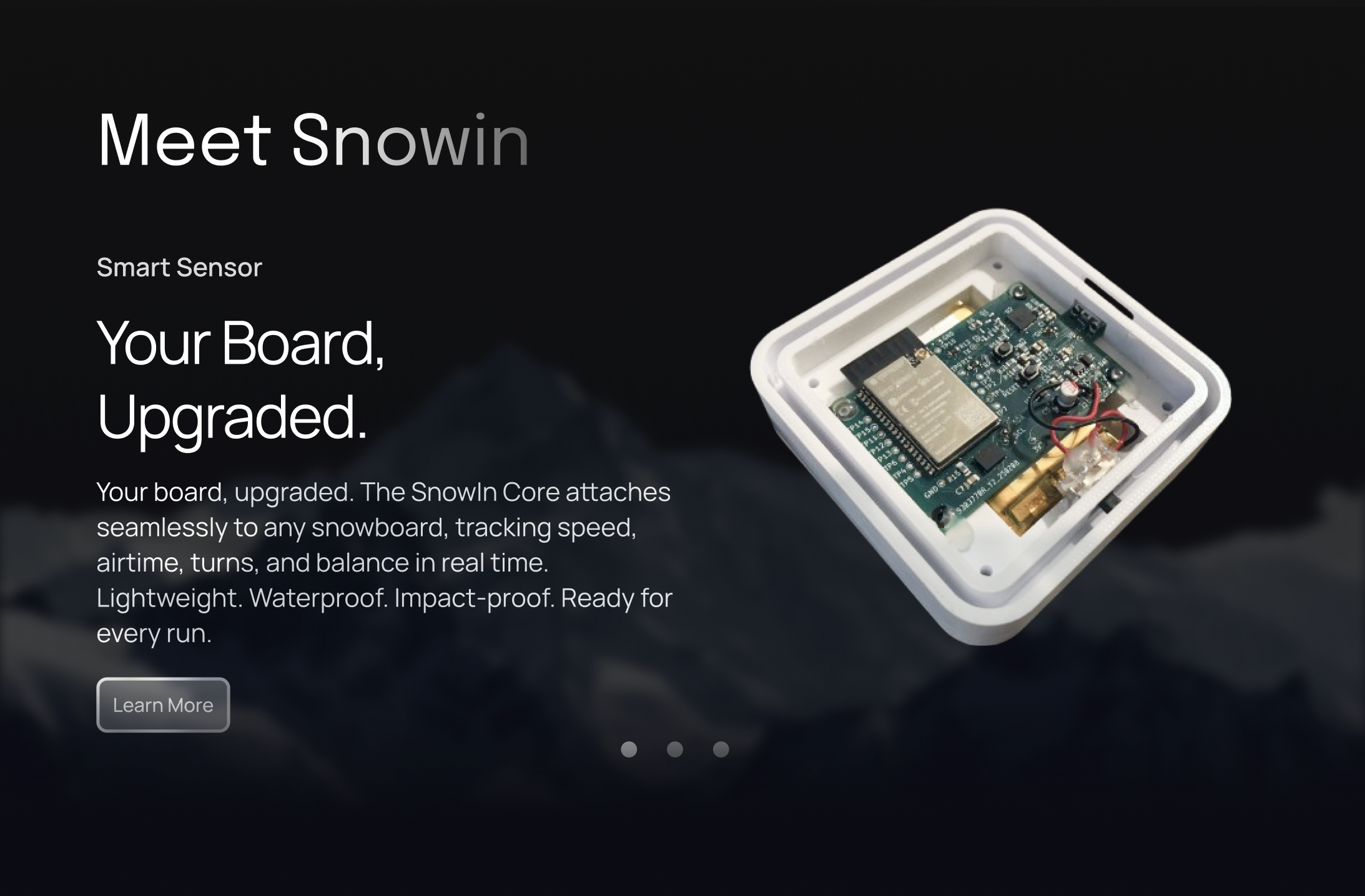
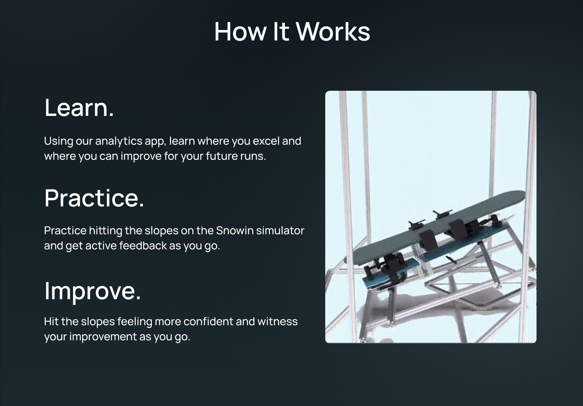
Prototype hardware that powers real-time tracking on the slopes.
We ran eight sprints across ten weeks, with design and development moving together instead of handing off at the end. I kept us grounded with clear sprint themes and success criteria.
Client kickoff, competitive + feature analysis, user flows, and early brand exploration. I aligned on success metrics and partnered with engineering to finalize the tech stack (React, TypeScript, Next.js) and repo structure.
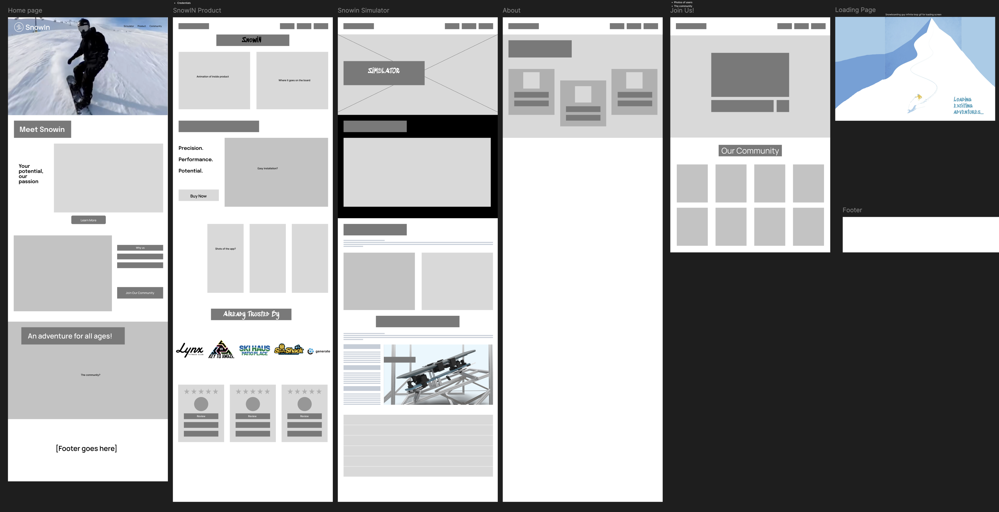
Lo-fi → mid-fi homepage and sign-up flow; analytics and simulator pages. Developers implemented routing, CTA logic, and responsive grids while we iterated live in Figma.

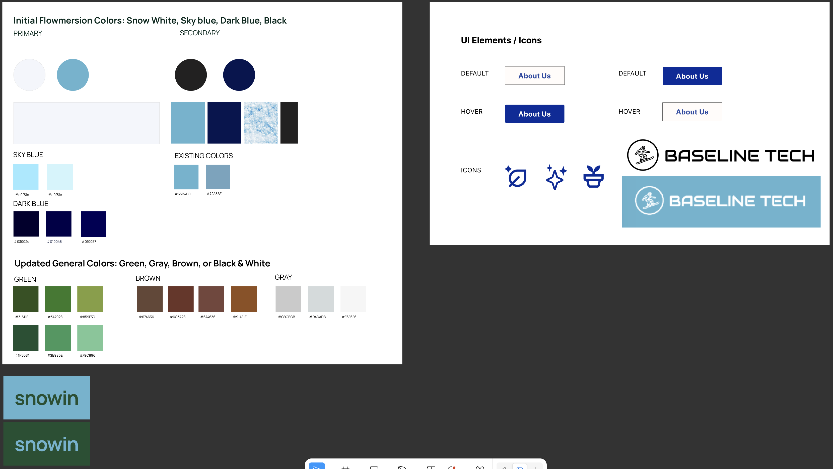
Finalized UI kit, design tokens, and accessibility updates. Dev integrated the new visual system, tuned animations, and optimized performance across breakpoints.
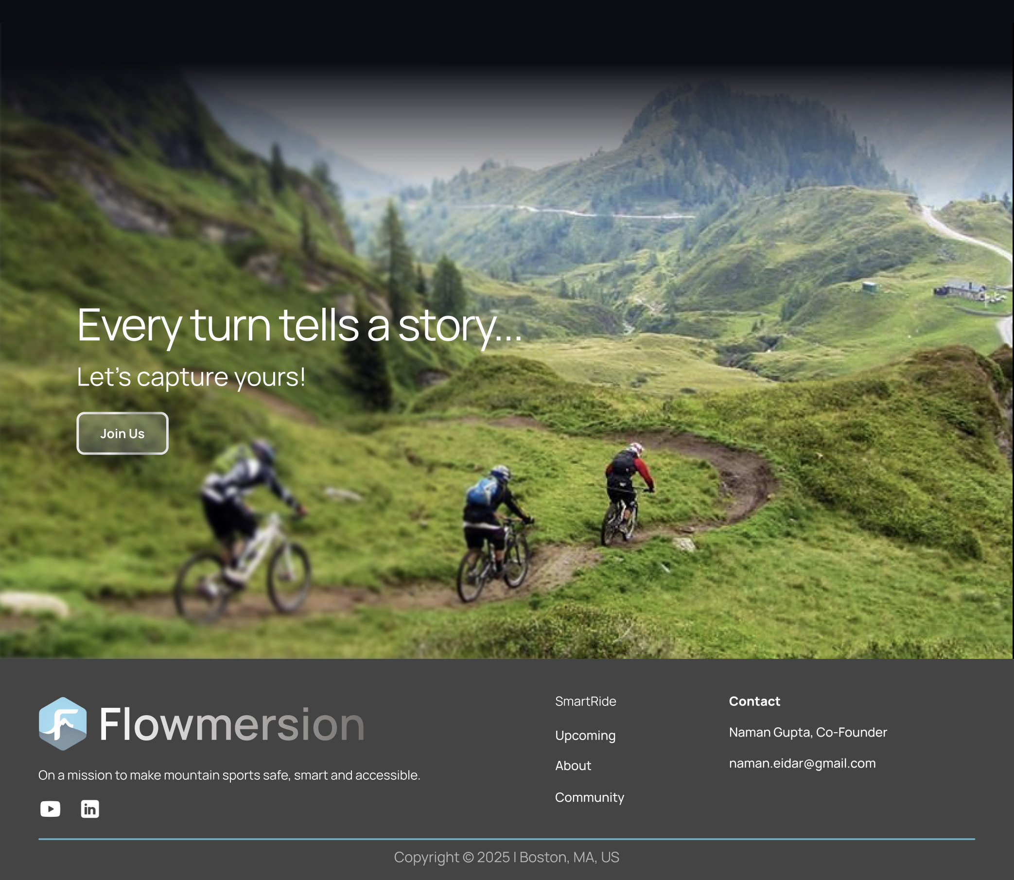
Tightened mobile layouts, verified flows on smaller screens, and collected stakeholder feedback. Dev handled cross-browser QA, bug triage, and analytics hooks.
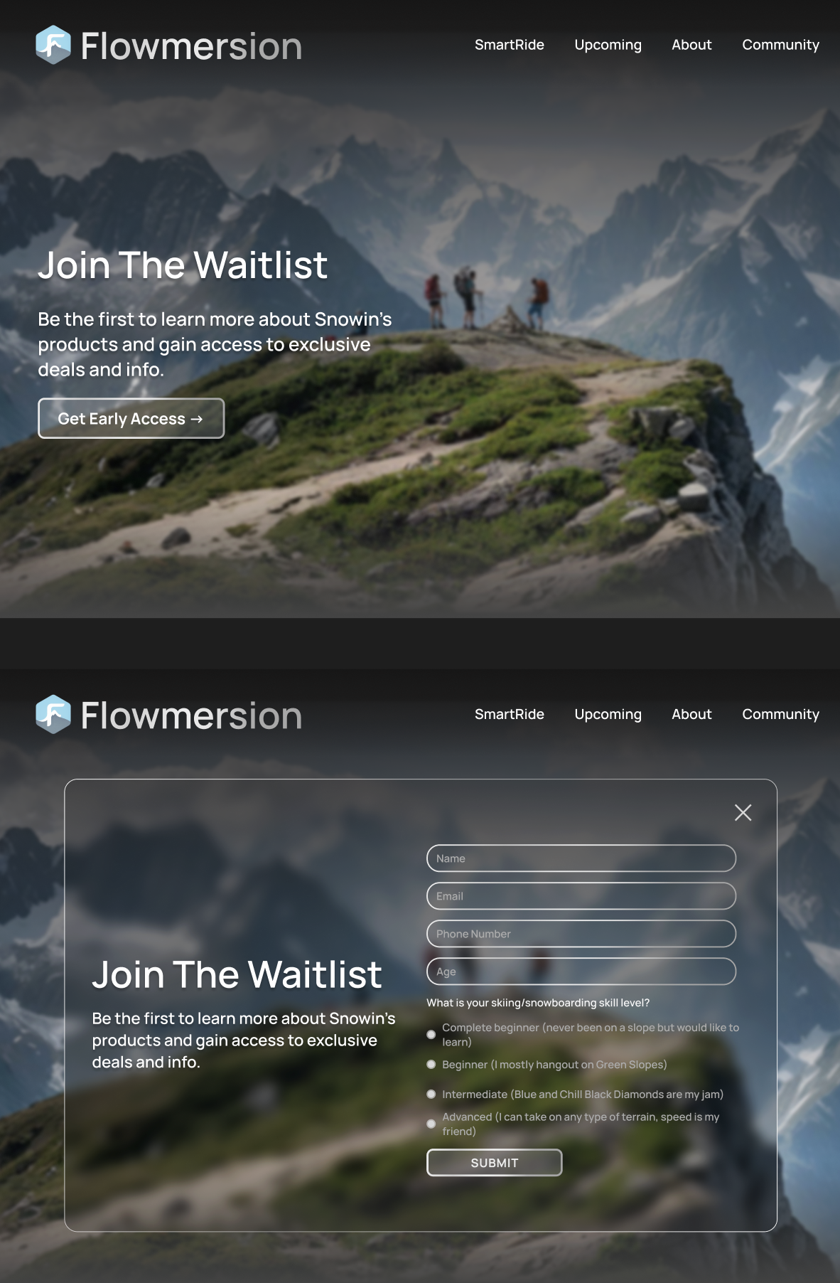
Delivered the brandbook, component guide, sitemap, deployment docs, and client training. Supported staging deployment and walked the team through how to extend the system.
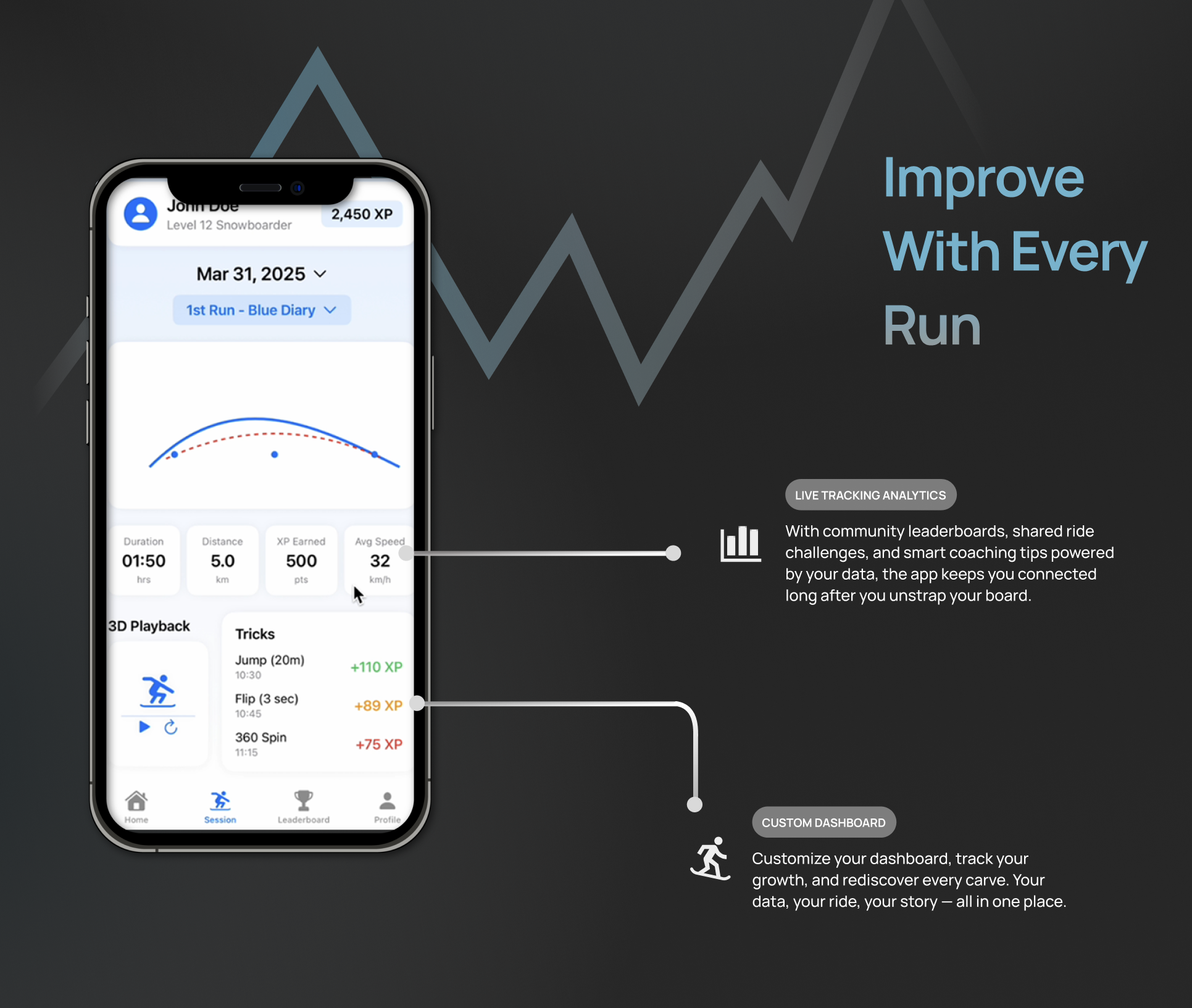
By the end of eight sprints, Flowmersion had a product story that investors, riders, and partners could repeat back in one sentence. The site became more than a marketing page – it became shared language for engineering, design, and leadership.
Unified the simulator and analytics device into one training journey – learn → ride → improve. That framing now anchors investor decks, partnership pitches, and internal planning.
CTA-forward layouts, simplified copy, and clearer hierarchy reduced perceived signup friction by ~30% in testing and increased form-completion intent by ~40%.
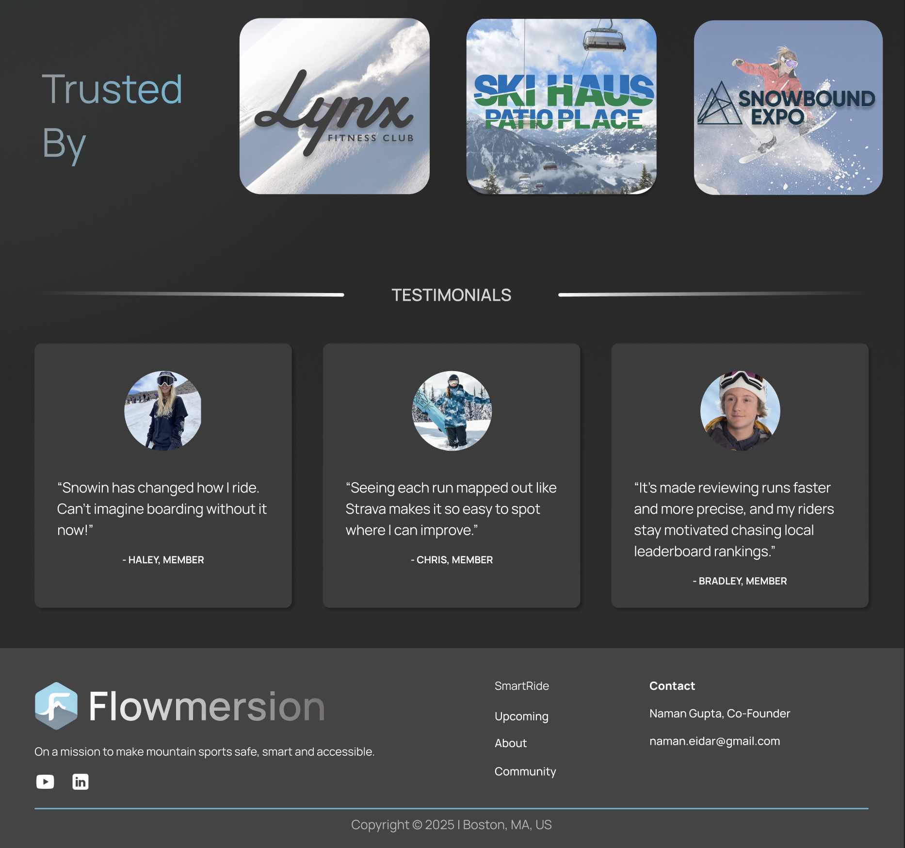
Added partner logos, testimonials, UI previews, and hardware visuals so that parents, riders, and resorts see concrete proof – not just claims.
Delivered brandbook, sitemap, and component system so future teams can ship new features without re-debating fundamentals every sprint.
Took a fuzzy founder vision (“simulator plus device”) and turned it into a concrete training loop, requirements, and success metrics the whole team could align on.
Ran tight, predictable sprints across design and development, balancing client asks with scope and making trade-offs based on impact instead of opinion.
Learned how to speak clearly to beginners and advanced riders at the same time – simple surfaces, deep details underneath – without overwhelming either group.
Built a brand + IA system that feels finished today but stays flexible for future pricing models, new devices, and additional product lines.
If I stayed on the team, this is how I would evolve Flowmersion – framed as a roadmap grounded in user needs and revenue growth.
Design and ship inventory-aware pre-order flows with device education, transparent availability, and clear confirmation states for early adopters.
Turn raw sensor data into a visual analytics layer – replay, XP, scores, and trends – so riders and coaches can make better decisions after every run.
Add leaderboards, challenges, and shared sessions to keep riders engaged and differentiate from tools that only focus on solo analytics.
Explore dashboards for resorts to manage riders, view aggregated insights, and host events – unlocking a second revenue channel for the platform.
